Part One: Analysing and Understanding Advertising Techniques
Analyse two different moving image advertising campaigns (this could be a social media or television ad.). Choose carefully, as one of these could be the product you re-brand. Consider what you have learned in class on advertising techniques (Minimum 500-800 words)
One of the moving image advertisements I am going to analyse is the 2014 Christmas adverts by Sainsburys – 1914. This advert was quickly one of the most popular and touching adverts of this year, as it represents how the two sides came together in love and festivity on Christmas. At the beginning of the advert we see some of the soldiers looking at letters, pictures of their loved ones and family, and the small gifts they were sent. We see the soldier pull out a chocolate bar from his envelope. They won’t be able to be with loved ones on Christmas Day, as they were still at war. Then we see all the soldiers singing a Christmas carol together. The following morning (Christmas Day), we see a soldier putting his hand up above the trench, this causes the German soldiers to panic and prepare for fight. One man on the other side does the same thing and they approach each other in no mans land, suddenly all the troops are together, shaking hands. They share photos and stories, and then break out in a massive game of football on no mans land. The game comes to an abrupt end as we there was a rumble and realisation that they needed to get back to their trenches. As Otto, the German soldier, gets back to his trench, he finds something in his pocket, and sees that the British soldier had put his chocolate bar in his coat for him. At the end of the advert the words ‘Christmas is for sharing’ appear on the screen. This advert was to commemorate the 100 year anniversary of the beginning of the first World War.
The advert despite being for Sainsburys also helped to remember the events that took place at that time. Following that, at the time Sainsbury’s were selling the chocolate bar that featured in the advert, giving 50p of each bar to the Royal British Legion. This advert contained the narrative structure, which as well as telling a story, pulled at the heart strings of the viewers as the events would be very close to many people’s hearts. This advert contained the value messages narrative, used to appeal to the audience via their emotions. By using emotional and personal messages, it will engage the viewer and enable the advert to stay prominent in their mind longer, making sure they remember it. So, in effect, the Sainsbury’s advert has used the touching and emotional message through the 1914 story, whilst also promoting their message for their shop – Christmas is for sharing.
The second moving film advert I decided to analyse, is the ZARA 2020 fall/winter women’s fashion campaign. The advert begins by showing a desolate location, with a car isolated with a woman in the front seat. The atmosphere is slightly eerie and isolated, as the black and white allows the mood to be darkened, especially with the eagle flying around the scene as well. This creates an atmosphere of suspicion and question around what is happening. The lady then gets out of the car, and is approached by three other ladies, as they approach each other, there is smoke coming off the floor, this makes the atmosphere very intense. Whilst doing these, the ladies are all dressed quite smart, with blouses, long a-line skirts and a tie. They are also seen walking through the grass and different terrain in heels. This gives it a very independent ladies vibe to the advert. Whilst creating a slight story to the advert, the models are also showing the collection, clothes and accessories, such as the heavy earrings shown on each model. The eagle is shown throughout the advert as a guidance, and eventually leads the models to the structure that they enter, the intensity builds by use of lighting and strobe lights in this part, as the advert is still in black and white. There was slight narrative in this advert, as there was an event throughout, however the advert didn’t tell a story to the audience. I would say this comes under, needs, fears and aspirations narrative, as people could be led to believe that purchasing their collection will enable them to live in a certain way, following the models.
Apply your knowledge to analyse two different print advertising campaigns, these should be sourced from magazines and newspapers of your choice (Minimum 500-800 words), include annotated copies of the print adverts).

For the print advertising I will be analysing both the 1950’s Tipalet cigarette advert, and the 2020 Savage x Fenty Lingerie branding. Also analysing these adverts from very different eras I am able to compare the different advertising techniques and see how print adverts has evolved through the years.
The first thing I notice in the first advert (1950’s ad), is the slogan ‘Blow in her face and she’ll follow you anywhere’. This is a euphemism, and also following the popular marketing technique of ‘sex sells’. The picture of the man and woman very close represents the intimacy between the two of them, and this is due to the cigarette, as they are advertising that the cigarette will entice and attract woman, purely by the smoke. Also referring to fellatio which links back to the sex sells marketing. This could be deemed as controversial which would gain more attention, especially in that era when sex wasn’t as openly spoken about. As the woman gazes into the mans eyes, he blows the smoke into her, as to entice her. The advert also talks about the different flavours and some information on the cigarettes. However, the information seems to be the less important subject of the advert as it is small in the corner in comparison to the slogan and image. Also, this advert contains a lot of bright colours, which would draw you in instantly before anything else, allowing the advert to stand out in others through its eye catching colours. In terms of target audience, I believe that this is targeted to both men and women, as it appeals to both genders, and ages 18 and above. Targeting the legal audience, as it was also illegal for under 18’s to purchase and use those products in 1950.
Annotation of this print ad:

Whereas with this advert, it is far more modern and straight to the point, sampling some of the lingerie that is available in this brand. The advertising in this print ad is far more direct. Although being a completely different product, the ads are significantly different in terms of branding and advertising. This advert is displaying Rihanna’s lingerie line, and showing some of the underwear sets that are available. Rihanna has been praised for her makeup and underwear line, for making diverse and inclusive products. For example, her lingerie stocks sizes up to 3XL and down to XS. She has also been praised for her diverse range of shades of makeup in her Fenty beauty line. With 50 different shade options, allowing almost every person to feel included and have an option for themselves.
This advert previews the diversity in Rihanna’s brand already, with the different ethnicities, and sizes of women in the campaign. The pastel colours in this advert are bright and engaging, also complimenting the women’s skin tones. These women are seen to be the face of the campaign, and their diversity and the diversity Rihanna includes in her line allows women and men to all feel included and thought of. The font and colour of the logo is representative of the branding on the products, so allows an insight into that for the potential customers. Similarly, the choice of the colours in the advert are enticing and eye catching for the potential customer, bringing their eyes to the product straight away. The company also using the advert technique of celebrity endorsement as it is Rihanna’s brand, which plays a huge part in the selling of these products, also making the brand far more popular as she will already have lots of business from her previous following on social media and her fans, who will be up to date with her brand releases.
Part Two: Choose a Magazine/Newspaper/Social Media Platform and Research the Audience
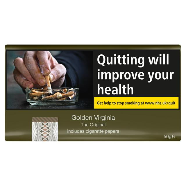
The product and advert I want to re-brand is the 1950’s smoking advert. I want to re-brand this and do a modern take on the advert. Also taking into consideration that the general opinion on smoking is different than it was in the 1950s. Branding is far different now, and people are discouraged from smoking, and the adverts featuring smoking, are discouraging people from smoking, rather than advertising different brands and products. Even to the lengths, that there is branding on smoking products talking about the risks and side effects that smoking can bring. This marketing technique was brought into play in 2008, with upsetting and disturbing images, warning people what may happen if they smoke.
This is the difference between the old and new packaging on cigarette products.

Despite this, i will be re-branding the advertisement for the cigarettes, but a modern take on the 1950’s version. Using a different colour scheme and different language to brand the product and different models and style within the advert.
I quickly realised that I would approach some difficulties within this task, as it is not permitted to advertise cigarettes anymore. And it is more of a taboo habit in the modern day, so advertising it will be very hard. I realised that I had misinterpreted the brief, and having to re-brand the advert meant a different thing to me initially. However, I will stick with it and make it work. So despite my advert probably turning out controversial and taboo, I will try to directly re-brand and customise the advert to suit the audience and modern day societal standards. Rather than advertising to smoke or not to smoke, I will create an advert that is able to be interpreted to the individual person.
For this part, I will be choosing the magazine Vogue, as many models and campaigns in this magazine feature smoking and cigarettes, so this leads me to believe that this magazine does’t discourage smoking, and therefore the advert would be appropriate for this magazine. Despite this being different to products they normally advertise, with products such as: clothes brands, model shoots and promotions, events and partnership opportunities. Vogue is a very contemporary magazine, and is one of the most highly regarding magazines in the fashion industry, influencing many readers day to day. Vogue has over 2.3 million readers a year, with over 1.8 million of those being women. Vogue’s intended audience is young women in their 20’s to 40’s, who are successful business women and have created a good life for themselves, and also are able to appreciate the novelties in fashion and beauty.
Within this, I researched the statistics for smokers in the UK, and over 12.5% of women in the UK are smokers. This equates to over eight million women in the UK. Meaning some women who are of the reader demographic, would be a part of the smoking statistic.
This research was conducted through the Conde Nast media pack for Vogue, a media profile for Vogue and a data report on the statistics for the amount of smokers in the UK.
https://www.statista.com/statistics/380962/vogue-monthly-reach-by-demographic-uk/
In addition to this, the social media I feel would be best suited for this advert is the platform would be a platform such and Pinterest or Tumblr. But for this particular advert, I will be choosing Pinterest. As I feel like Pinterest is a very modern and contemporary social media, with less mainstream expectations than a social media such as Instagram or Facebook, as these apps are catered to try to be more PG. Pinterest has a user demographic of 60% women, and 40% men. With the most prominent age group being 25-34 year old’s being the highest percentage (36%), and 18-24 year old’s being in the second bracket of 34%. Pinterest enables you to create boards and pin to them, almost like a virtual mood board or idea board. Giving suggestions to posts and customised to your interests. Therefore, meaning my advert would only show to people who view or pin relevant or similar content. The ads are customised and fit to peoples preferences on the app, meaning they wouldn’t receive unwanted or irrelevant content on the app, unlike other social media platforms, that often show irrelevant content and ads. Pinterest is often used for research and inspiration, or people can use this platform just to create mood boards of certain aesthetics etc. Some popular content on the platform is fitness and well being, maternal and childhood information, travel, food, beauty or simple and general aesthetics – similar to the content you could see on Tumblr. So in terms of advertising, it wouldn’t be an unwanted or irrelevant advert to the audience.
This research was conducted through these websites:
Creating reader profile’s for both Vogue and Pinterest:
Part Three: Two Proposals
Print Advert Campaign:
My idea to re-brand is to change the idea of the advert and to advertise against smoking rather than to promote the cigarettes themselves. ,
I made a PowerPoint to present my proposal and pitch, however I will go into more detail further on here. Here is the PowerPoint I made:
My proposal went relatively well considering the circumstance I presented my proposal in – not knowing where I was at within the brief and project. I received some good feedback, which has helped me to elaborate on my idea, and helped to guide me in a good direction with my advert. Some of the feedback I received, I will put down here:
I also received some helpful feedback from my teacher, as he suggested re-branding the advert into an alternative to smoking rather than against, which will make the rebrand far easier as I can base it on the same advertising and imagery. For example, something like Vaping or nicotine patches, alternatives that are well known to modern society already. So following that, I will photograph and film an advert based on the alternative – vaping. I will use some friends as models, those of which who actively use a vape and smoke, so I can preview the difference between the two. I will still shoot some images of smoking cigarettes to show the contrast in the two and the way in which they are significantly different. For my moving image I will shoot the person vaping and a background audience of some people smoking, to show the difference in the two. Also going off the basis of the original advert, using the concept sex sells, I will shoot the boy vaping and him being with a girl, and the way in which she will ‘swoon’ over him, as implied in the original advert, that where you go, she will go, when smoking. So in that sense will be directly reflecting the original intention of the smoking advert.
Double Page Spread plan:

Single Page Advert Plan:

These are rough plans for my print ads, not including colour or any actual placement as of yet. I need to get my models and images before I can construct proper drafts, but constructed these to gage a rough idea of how I want them to look, and ideally be as similar to the original advert, in order to create a mirrored rebrand.
Moving Image:
For my moving image ad, I will potentially be using the same male model as my print ads, but with a couple female models as well. There won’t be any dialogue within my ad, and will hopefully contain one of my friends songs, if he gives me permission to to use it in my advert. I am unsure of the story line as of now, I will create a mind map with different ideas for my moving image below, as I need to come up with two separate 10-30 second ads.
Once I have come up with my ideas and constructed a proper plan for all of my adverts, I will then complete all the relevant Pre Production Paperwork which I will put below.
I had planned to do a shoot with two models and have one of them vaping – main part of the advert, the diversion and alternative to smoking, and the other model smoking. The difference between the two would’ve been addressed in clothing and appearance, as well as stance and position. I would’ve had a similar concept throughout my moving image advert too, with no speech, just background music and noise, with their actions speaking for them. There would’ve also been a featuring girl in these adverts, to add to the ‘sex sells’ part of the advert, and contributing to the appeal to the male model who is vaping, and the repel to the one smoking.
However, I came into some struggle with COVID, as the two male models I had originally planned to shoot had to self isolate at different times, and then as we had planned to shoot again, we came into a national lockdown. This put a real spanner in the works as I now have to rethink the way in which I will conduct my advertising brief. I realised I have some images from last years ‘Photography Journalism’ where I captured two male models smoking, I can adapt these images to fit my adverts theme and potential. It will mean changing the concept slightly but I’m sure I will be able to change the theme of the avert slightly. Following that, in terms of the moving image advert, I am slightly stuck on how to overcome this as I have no previous footage and no way of capturing any footage relative to the theme and background of my rebranding.
Here are the images I shot last year, that I will have to use for this rebranding. I have a contact sheet but do not have multiple shots, I only have the final images as I don’t have access to my college desktop documents.


These are the three images I have to choose from for my single and double page ad.
I am thinking I will use this image for the single page ad:

And this one for the double page:

The first image being a replicant of what would’ve been my two male models – they are smoking cigarettes rather than vapes, so I will have to change the concept of that. The original branding in the main advert was ‘Blow in her face and she’ll follow you anywhere’.
Here is the written idea for my moving ad too:

Pre Production Paperwork for the moving image ad:
Editing and making of the DPS advert:
I began with my double page advert, using the editing software – GIMP, to edit and photoshop my image. Here is a screenshot of me finishing the process:

Using this allowed me to cut out the main focus of the image and leave a transparent background, which will enable me to put this image on a DPS advert set up. Here is the finished image:

I then used the software Lucidpress to create my DPS advert. I’m using the slogan ‘If you blow, she will not follow’ – a variant of the original slogan.

For my DPS advert, I have changed from the original plan to suit the original advert style better, despite it being a rebrand, I felt as if it should still have a similar look.
The first draft DPS advert:
Change of idea:
Then, after producing my first draft, I decided it might look better suited if I changed the focus image to look like a cartoon, similar to the original advert. Following that, I went back onto GIMP to edit the image. As I was editing this, I realised it may look better as the single page ad, and the other picture vice versa. So, I am going to make one of each to compare and see which one looks better.
I created this for my DPS, and much prefer it, so this is my final draft and final piece:

Final DPS:
My single page advert:
Following the earlier change I made to my DPS and single page ads, I used the picture that was originally for the DPS. Using again GIMP and Lucidpress to create:

The final single advert:
Both adverts based on the original male powerful, and somewhat very sexist advert. Both using slogans similar to the original, in order to appropriately rebrand the original advert.
Moving image ad:
I changed my idea again for the moving image advert, I decided to do adverts of one person individually to suggest the loneliness that smoking can bring you, and that despite what 1960s adverts tell you, it does not attract the opposite sex.
Here are the two adverts I made:
The four finished adverts:
Part Four – Reflecting on Success:
Peer feedback:


I believe throughout the brief I was able to meet the audience needs as I focused my whole advert ideas on the rebranding of the original advert. My target audience was both male and female, of the ages 18 and above. Also predominantly focusing on active smokers, encouraging them to quit, but also targeted at those who don’t smoke, to enable them to see that people are quitting, and that it doesn’t make you any more attractive or desirable to others if you do smoke. I believe my adverts are engaging enough to involve and attract the audience to them, and therefore advertise the intended message and product. My audience differed slightly to the intended audience of the original advert, as in the original advert was selling cigarettes to older men, enticing them with the attraction of women. This is where I faced my first issue in the assignment, as I had misinterpreted the brief and realised, I couldn’t directly replicate the original advert, and would have to change my idea. This was changed and worked on as I produced my pitch with the help of teacher and peer feedback, allowing me to understand how I’d missed the point, and get back on track from here. Reflecting on that, I should’ve used the PowerPoints and media we were given to help me to understand the brief better, so that I wouldn’t have been slightly set back by my misunderstanding. Following that, I think after I changed my idea and mind about what I wanted to do, I was able to create something more audience effective.
Looking back on the assignment, I realised I wasn’t very effective at choosing an idea and working on it. For example, when it came to my moving image advert, I changed my mind as I was filming them, and had to adapt my filming to my new idea. Similar with the print advert. I understand this is all part of the process, but I think I could’ve probably planned slightly better, and expanded on different ideas, as to have more options when it came to creating, rather than changing my mind at the end. Despite that, I ended up being happy with the finished print adverts, the editing and the layout of them. I was slightly underwhelmed by my moving image adverts, but due to COVID restrictions, all my adverts were altered to suit the circumstances.
I enjoyed the researching and development of this assignment, it allowed me to see what goes into advertising, and the thought process behind adverts. I also enjoyed researching into a brand and the planning and idea process behind the planning of the actual adverts. Following that, I enjoyed the editing process of these print and moving adverts, which is normally a step I struggle with and don’t enjoy as much, but the software I used made it easier to understand and produce what I had in mind. I think this assignment gave me a good insight into how advertising works and what it entails.
